Scaffolding, Layout, and Composition in Flutter
In this session, you will learn how to build mobile layouts in Flutter: structuring screen scaffolding (Scaffold and SafeArea), distributing elements on screen (Column, Row, Expanded), applying visual styling (Container and Padding), and resolving layout overflows (RenderFlex overflow) using SingleChildScrollView.
1. Architectural Convention: Screen vs. Page
In Flutter, a well-structured screen clearly separates the outer frame from the inner content:
Screen(Route Screen): The navigation destination. It is the sole entity responsible for returning theScaffold(with itsAppBar,BottomNavigationBar, orFloatingActionButton).Page(Inner Canvas): The visual content that lives inside thebodyof theScreen. It must never return aScaffold, only layout widgets (SafeArea,Column,ListView, etc.).
- Visual Diagram
- Dart Code

import 'package:flutter/material.dart';
import '../pages/home_page.dart';
// SCREEN: Global frame with Scaffold
class HomeScreen extends StatelessWidget {
const HomeScreen({super.key});
Widget build(BuildContext context) {
return Scaffold(
appBar: AppBar(
title: const Text('My Application'),
centerTitle: true,
),
// Hosts the Page inside its body. Zero nested Scaffolds.
body: const HomePage(),
);
}
}
import 'package:flutter/material.dart';
// PAGE: Content canvas (NEVER returns a Scaffold)
class HomePage extends StatelessWidget {
const HomePage({super.key});
Widget build(BuildContext context) {
return SafeArea(
child: Padding(
padding: const EdgeInsets.all(16.0),
child: Column(
crossAxisAlignment: CrossAxisAlignment.start,
children: const [
Text('Welcome to the inner view'),
SizedBox(height: 12),
Text('Here lives the modular content of the screen.'),
],
),
),
);
}
}
Nesting a Scaffold inside another triggers serious UI conflicts: notifications (SnackBar) are hidden or misplaced, duplicate app bars (AppBar) consume valuable screen real estate, and the virtual keyboard covers input fields because both Scaffold instances attempt to resize simultaneously (resizeToAvoidBottomInset).
2. Scaffolding and Hardware: Scaffold and SafeArea
Modern mobile devices feature notches, rounded corners, punch-hole front cameras, and system gesture bars. Scaffold and SafeArea guarantee that your user interface is never obstructed by these hardware obstacles:
Scaffold: Provides the canonical Material Design slots (appBar,body,floatingActionButton,bottomNavigationBar).SafeArea: Automatically injects the necessary inner insets to protect content from the top status bar and the bottom gesture/home bar.
- Visual Diagram
- Dart Code

import 'package:flutter/material.dart';
class SafeDemoScreen extends StatelessWidget {
const SafeDemoScreen({super.key});
Widget build(BuildContext context) {
return Scaffold(
appBar: AppBar(
title: const Text('Hardware Insets Protection'),
),
// SafeArea protects content against the notch and bottom gesture bar
body: SafeArea(
child: Padding(
padding: const EdgeInsets.all(16.0),
child: Center(
child: Text(
'This content will never be clipped by the notch or the bottom gesture bar.',
textAlign: TextAlign.center,
style: Theme.of(context).textTheme.bodyLarge,
),
),
),
),
bottomNavigationBar: NavigationBar(
destinations: const [
NavigationDestination(icon: Icon(Icons.home), label: 'Home'),
NavigationDestination(icon: Icon(Icons.person), label: 'Profile'),
],
),
);
}
}
3. Linear Layout: Row and Column
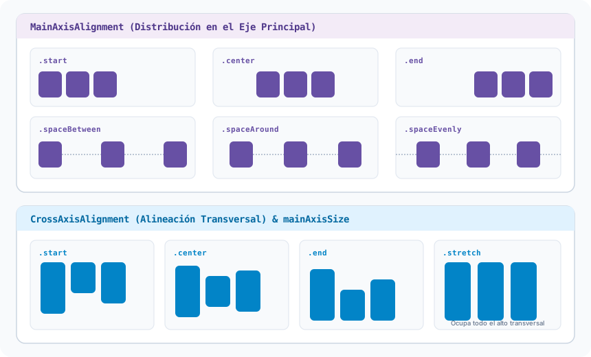
To position elements in a single direction, Flutter provides Row (horizontal) and Column (vertical). Each operates across two coordinate axes:
- Visual Diagram
- Dart Code

Main and Cross Axis Visual Alignments:
import 'package:flutter/material.dart';
class LayoutRowColumnExample extends StatelessWidget {
const LayoutRowColumnExample({super.key});
Widget build(BuildContext context) {
return Column(
// Column's main axis: Vertical
mainAxisAlignment: MainAxisAlignment.center,
// Column's cross axis: Horizontal
crossAxisAlignment: CrossAxisAlignment.stretch,
children: [
// Horizontal row with spaceBetween distribution
Row(
mainAxisAlignment: MainAxisAlignment.spaceBetween,
crossAxisAlignment: CrossAxisAlignment.center,
children: const [
Icon(Icons.star, color: Colors.amber),
Text('Center Element'),
Icon(Icons.favorite, color: Colors.red),
],
),
const SizedBox(height: 16),
ElevatedButton(
onPressed: () {},
child: const Text('Cross-Axis Stretched Button (stretch)'),
),
],
);
}
}
4. Responsive Layout: Expanded and flex
Instead of hardcoding fixed widths or calculating manual percentages using MediaQuery, we use Expanded so that a child absorbs the remaining available space:
- Flexible space: Combining fixed-width boxes (e.g. 70px) with
Expandedallows the flexible widget to adapt automatically to any screen width. - Proportions with
flex: When placing multipleExpandedwidgets, the integer factorflexdivides the space proportionally (e.g.,flex: 1andflex: 2allocate 33.3% and 66.6% of the remaining space).
- Visual Diagram
- Dart Code

import 'package:flutter/material.dart';
class ExpandedFlexDemo extends StatelessWidget {
const ExpandedFlexDemo({super.key});
Widget build(BuildContext context) {
return Column(
children: [
// 1. Fixed-width items at ends and Expanded in the center
Row(
children: [
Container(width: 70, height: 48, color: Colors.blue.shade100, child: const Center(child: Text('70px'))),
const SizedBox(width: 8),
Expanded(
child: Container(
height: 48,
color: Colors.purple.shade100,
child: const Center(child: Text('Expanded (Absorbs space)')),
),
),
const SizedBox(width: 8),
Container(width: 70, height: 48, color: Colors.blue.shade100, child: const Center(child: Text('70px'))),
],
),
const SizedBox(height: 16),
// 2. Proportional distribution with flex: 1 (33.3%) and flex: 2 (66.6%)
Row(
children: [
Expanded(
flex: 1,
child: Container(
height: 48,
color: Colors.teal.shade100,
child: const Center(child: Text('flex: 1 (33.3%)')),
),
),
const SizedBox(width: 8),
Expanded(
flex: 2,
child: Container(
height: 48,
color: Colors.indigo.shade100,
child: const Center(child: Text('flex: 2 (66.6%)')),
),
),
],
),
],
);
}
}
5. Boxes and Styling: Container vs. Padding
Padding is a lightweight, single-responsibility widget designed purely for inner spacing. Container is the swiss-army knife combining dimensions, margins, borders, and complex decorations:
- Visual Diagram
- Dart Code

import 'package:flutter/material.dart';
class ContainerDecorationExample extends StatelessWidget {
const ContainerDecorationExample({super.key});
Widget build(BuildContext context) {
return Container(
margin: const EdgeInsets.all(16.0), // Outer spacing
padding: const EdgeInsets.all(20.0), // Inner spacing
decoration: BoxDecoration(
// CRITICAL RULE: Background color MUST reside inside BoxDecoration
color: const Color(0xFFF9F1FD),
borderRadius: BorderRadius.circular(16.0),
border: Border.all(color: const Color(0xFFCBC4D2), width: 1.5),
boxShadow: [
BoxShadow(
color: Colors.black.withOpacity(0.06),
blurRadius: 10,
offset: const Offset(0, 4),
),
],
),
child: const Text(
'Card styled with rounded corners and subtle shadow.',
style: TextStyle(fontWeight: FontWeight.w500),
),
);
}
}
When using decoration: BoxDecoration(...), the background color must be defined inside BoxDecoration. Supplying color directly to the Container while simultaneously specifying decoration causes a fatal runtime assertion error ('color == null || decoration == null').
6. Overflow Prevention: SingleChildScrollView
When the children of a Column demand more height than the physical screen can offer, Flutter displays the infamous yellow and black hazard stripes (RenderFlex overflowed).
- Visual Diagram
- Dart Code

import 'package:flutter/material.dart';
class ScrollSolutionExample extends StatelessWidget {
const ScrollSolutionExample({super.key});
Widget build(BuildContext context) {
// SingleChildScrollView eliminates the RenderFlex overflow hazard
return SingleChildScrollView(
padding: const EdgeInsets.all(16.0),
child: Column(
crossAxisAlignment: CrossAxisAlignment.stretch,
children: [
for (int i = 1; i <= 6; i++) ...[
Container(
height: 100,
decoration: BoxDecoration(
color: Colors.purple.shade50,
borderRadius: BorderRadius.circular(12),
border: Border.all(color: Colors.purple.shade200),
),
child: Center(child: Text('Content Card #$i')),
),
const SizedBox(height: 12),
],
FilledButton.icon(
onPressed: () {},
icon: const Icon(Icons.check),
label: const Text('Submit Form'),
),
],
),
);
}
}